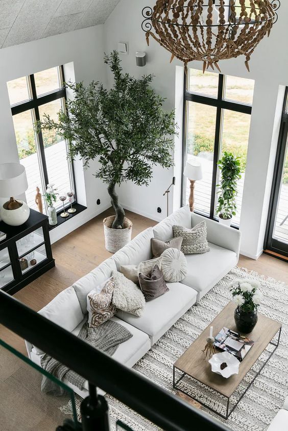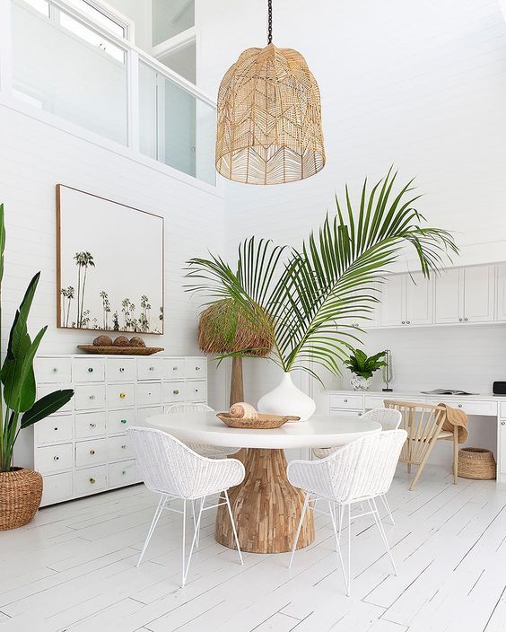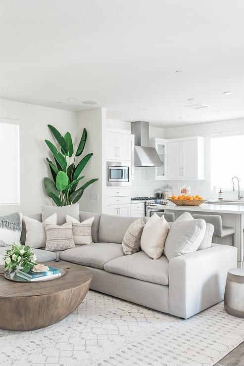
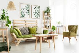
Each of us has a passion for decoration and wonderful and creative ideas to make the place around us more beautiful. So this is same ideas to make your house more elegent
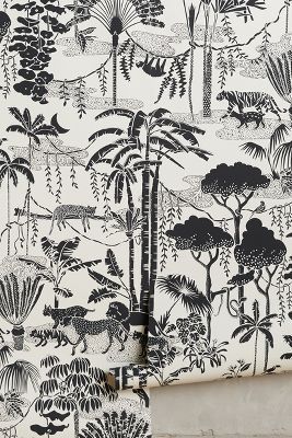
In this year we will see the
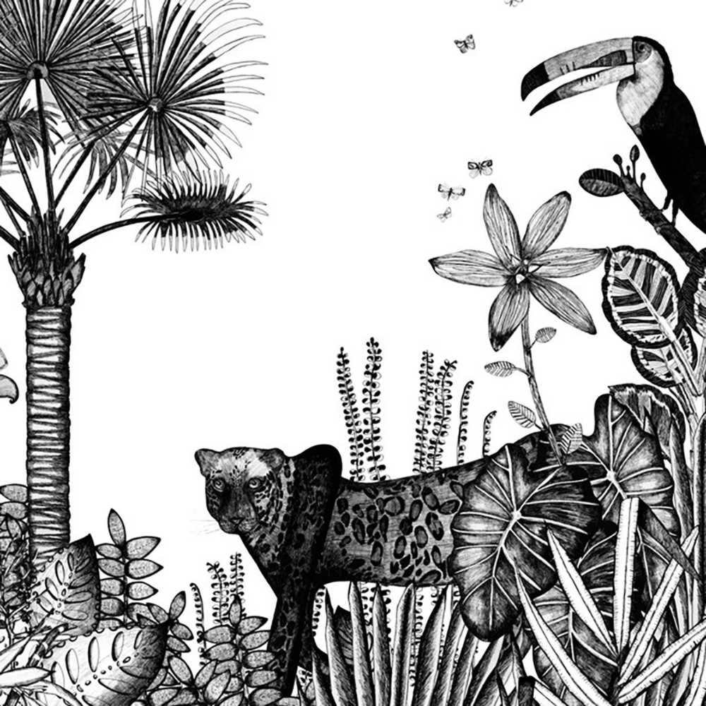
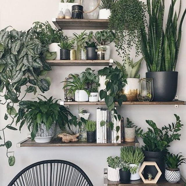
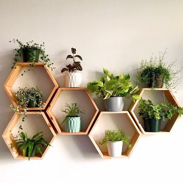
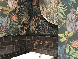
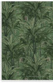
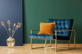
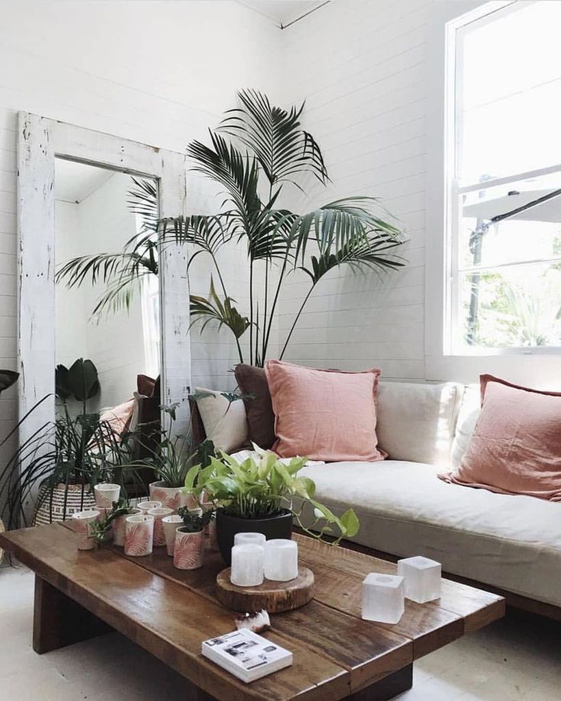
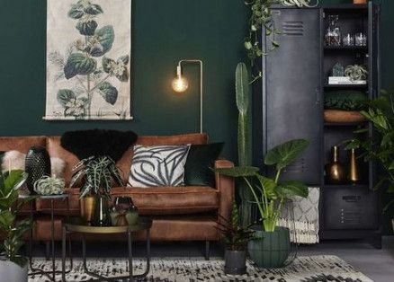
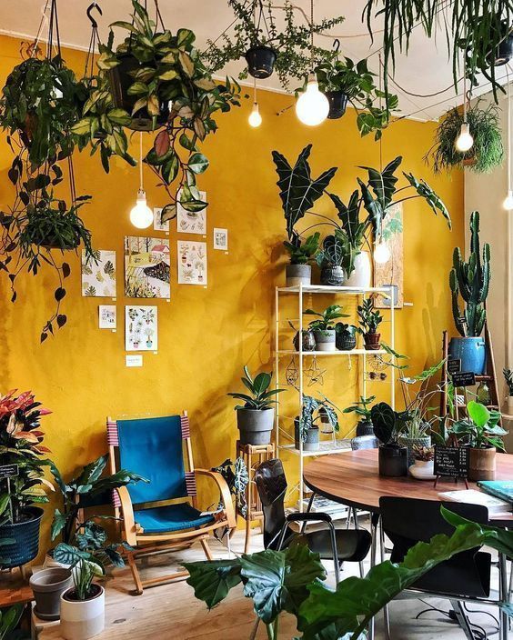
theme of the jungle alot specialy in the spring beacause he adds a warm and fresh feel at the same time in the room .
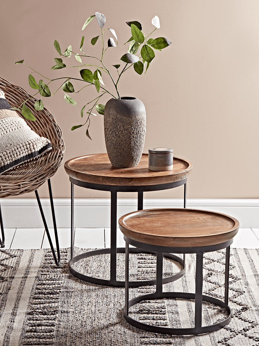
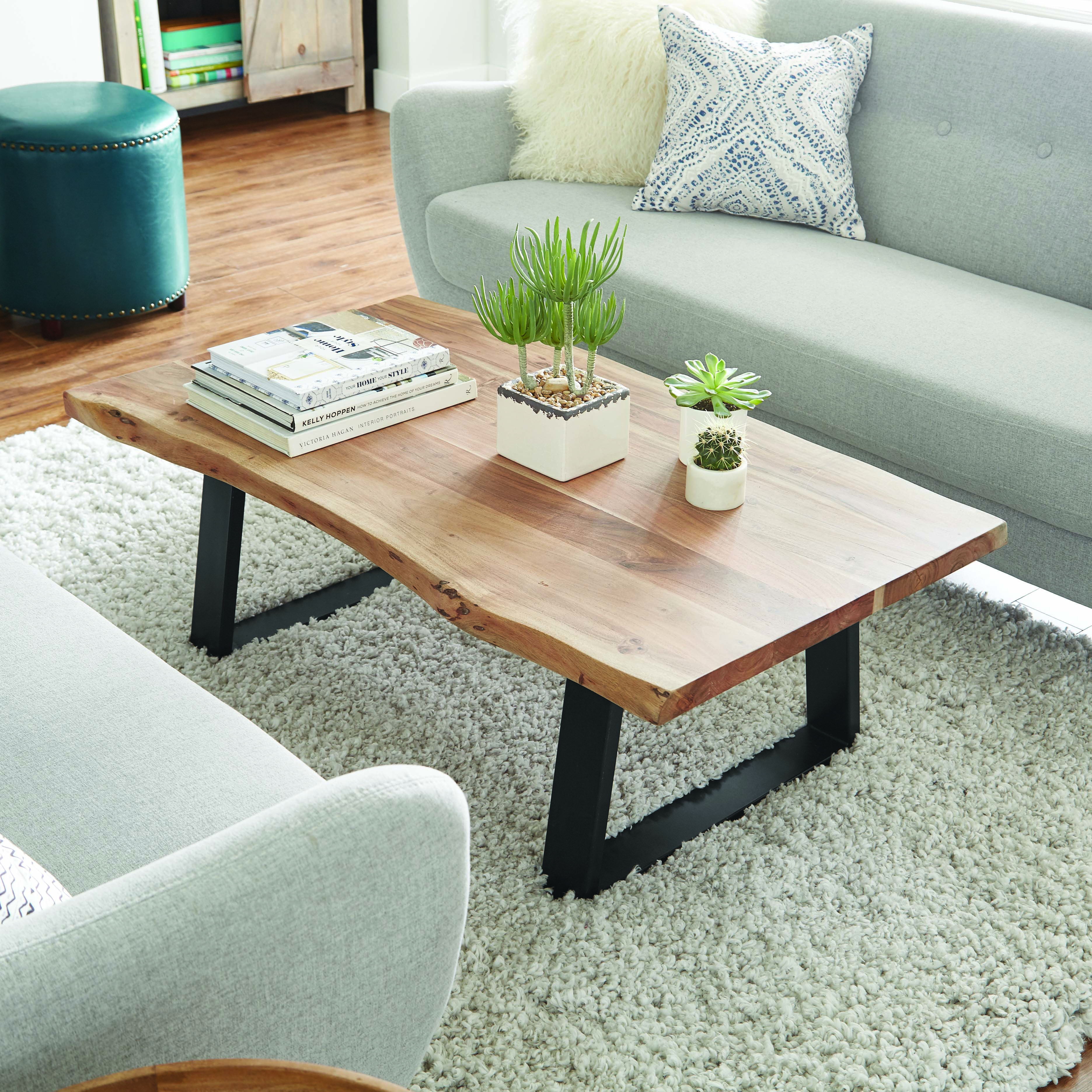
So you can add fresh plants or plastics you can add wallpaper that is in this theme or you can put wooden tables near the sofa and put on it same little plants


10 trendy colors for 2020
The colors allow to give stamp to the rooms of your home. They vary according to decorative trends, going from a light and soft touch to a darker or neutral point. Remember, however, that your color choices should also look like you. If the color charts are continuously growing, a few color trends stand out.
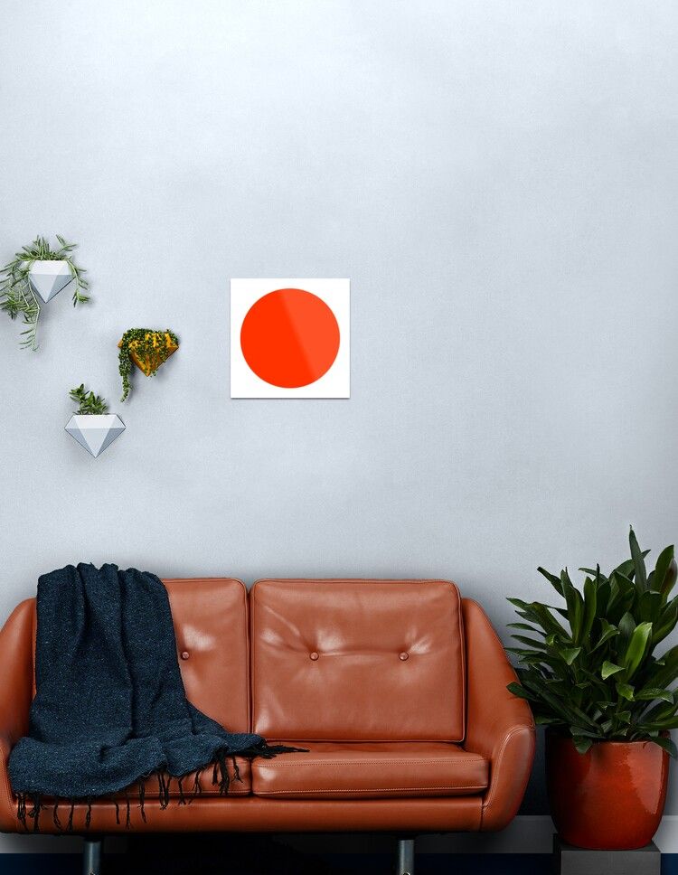
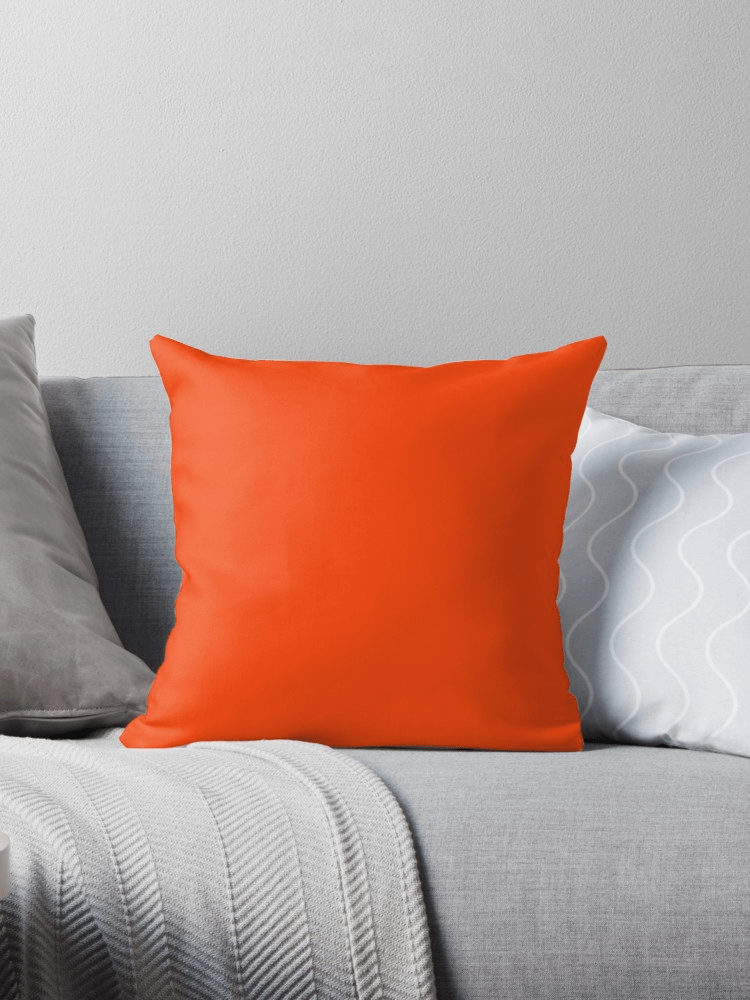
Lush Lava
Color synonymous with vitality and action, red has a real influence on our mood. Because it has stimulating effects, it is recommended in living rooms such as the entrance hall, living room and office or even the kitchen. Red is one of those colors that also creates a feeling of warmth and comfort.
With white, red and all its nuances will be sublimated and vice versa. Depending on the color associations, the intensity of red will be amplified or, on the contrary, softened.
We will opt for grays, dark grays, blacks or even dark neutral tones to attenuate it. The marriage will be successful as soon as the room has lots of natural light. With an off-white, the strength of a dark red will be calmed for an atmosphere that is both chic and bright.
We can also play with striking contrasts by coupling a vermilion red with a cyan blue or an ultramarine blue for a pop pop atmosphere. Of course, these combinations
As for the red and purple marriage, it is also tempted even if it seems very daring.

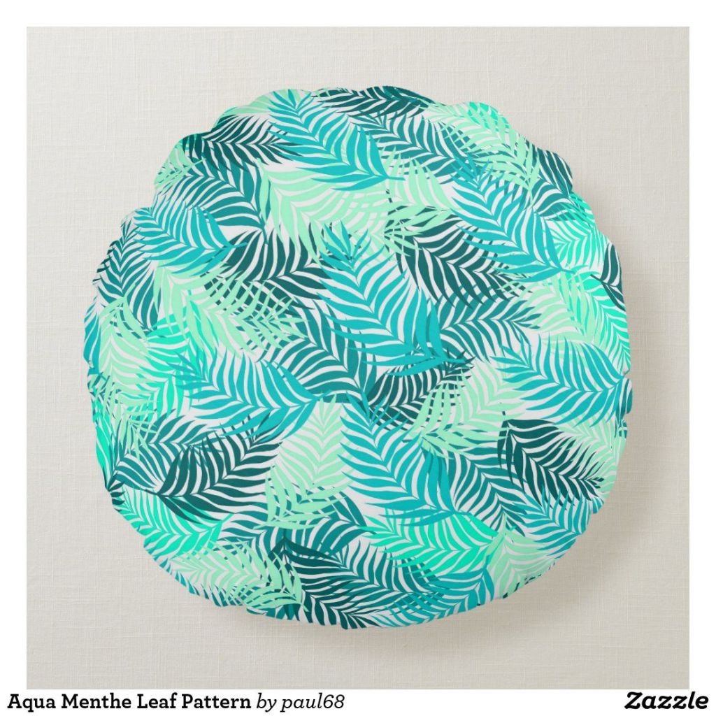
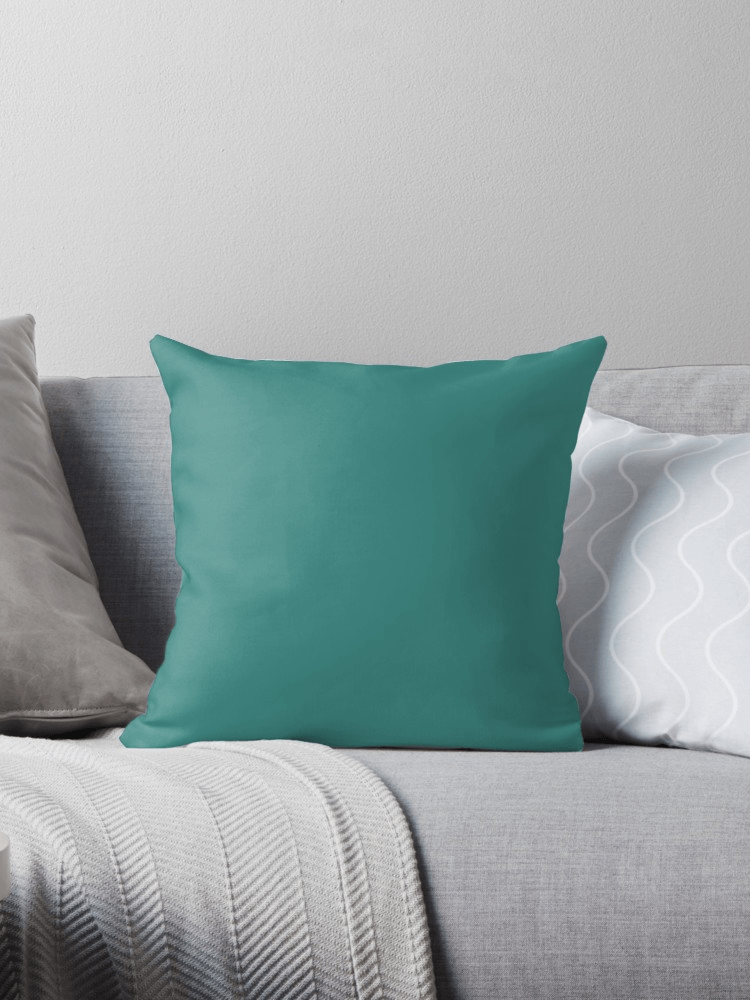
Aqua Menthe
Green is available in multiple tones, to vary the effects. When they are lighter, the greens are as soothing as white and it is very pretty in a room because it brings freshness and dynamism in the morning. As for the intense greens, they have nothing to envy to yellow or red.
It is often said that it is perfect in an office because green is conducive to concentration! It is a color which harmonizes quite well with most of the others (because it is a harmonious color which tempers), whether with pale yellow, blue, pink or – above all – colors « of earth Like ocher, beige, taupe or brown.


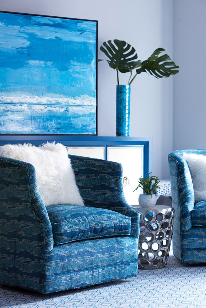
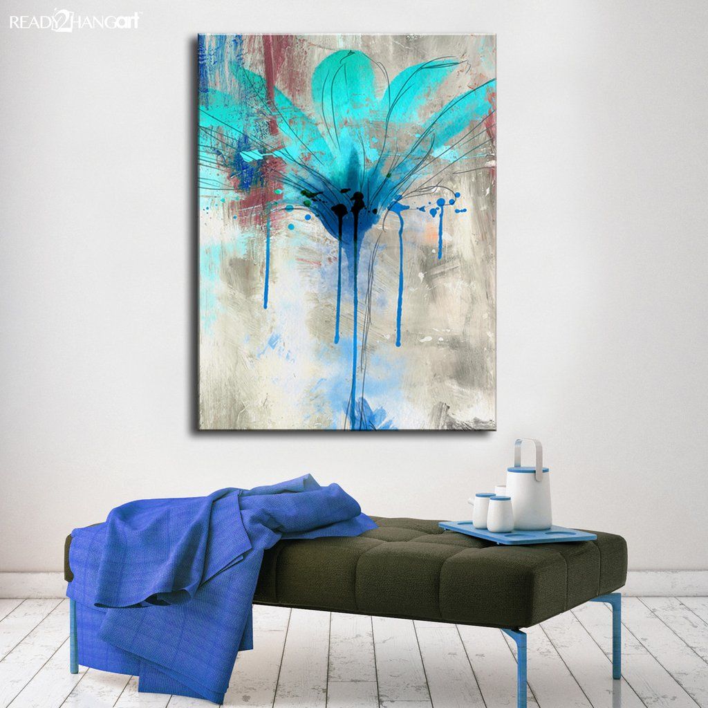
Phantom Blue
blue is an easy to use color. Called « cold », it is difficult to place in living rooms, especially when they are badly exposed to light. However, blue can be soft and cheerful, especially with other tones (the ones that blend best are pink, gray and off-white), in shades (sky blue, navy blue, turquoise, mauve, etc.). ) or by playing with paint effects (with a sponge for example).
If the blue is often declined by touch, it does not hesitate to impose itself in total look in the bathroom since in addition to being associated with water, it confers a calm and soothing atmosphere. It is also very present in the rooms. Child or adult, whatever, the bedroom with blue walls is timeless and instantly soothes. It is a color that is also found a lot in seaside homes like in Brittany. Travelers or those with « sea legs » also often have blue at home.
It’s a symbol of freshness and purity. And even wisdom and truth. It inspires inner calm, promotes imagination and dreams. It is also the allegory of peace (see the UN and European flags which are blue).
Blue is generally a color associated with boys. Its other powers are numerous: it is the habit of the police, it is the « blue collar » of the workers, « the Blues » who designate the French football team, the color of EDF, the color of people on the right and recently it is one of the four colors adopted by the European community for selective sorting containers and bins (the blue containers are intended to receive newspapers for recycling paper).

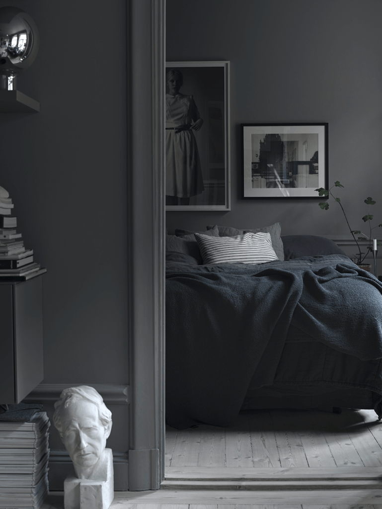
gray
gray is like elegance, like black, and has soothing and calming properties with a refined connotation. In Feng Shui, gray is associated with metal, a Yin color linked to relaxation, rest, contemplation, leisure. It is particularly recommended in rooms and libraries.
The color gray is undeniably the color that suits any room in the house and adapts to all styles of decor. Used in total look or with touches, gray allows atmospheres as classic as contemporary. It is its tone, location, decor, furnishings, accessories and even the flooring that will define the overall spirit of the room and its harmony.
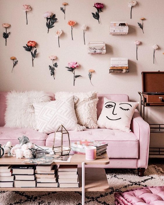
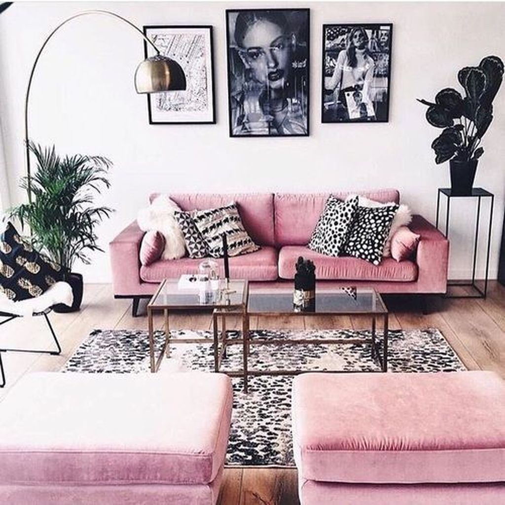
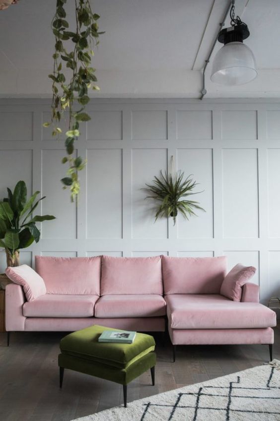
Pink
Dynamic color punctuated by a touch of delicacy, pink has always represented sensuality, happiness, sweetness, seduction, romance, youth, childhood … In Feng Shui, it embodies tenderness, love and is recommended as well in a child’s room or parental.
The powdery pink goes perfectly with shades of darker and desaturated tones such as eggplant or plums, even raspberries. Pink combined with blue skies, acid yellows or wasabi green will give off a fresh and more « girly » atmosphere. Combining pink with black or gray suggests an atmosphere that is both contrasting and elegant. Finally if all the shades of pink find an accomplice with a variant of green, its complementary color, we will avoid the marriage with emerald green at the risk of obtaining a garish rendering.
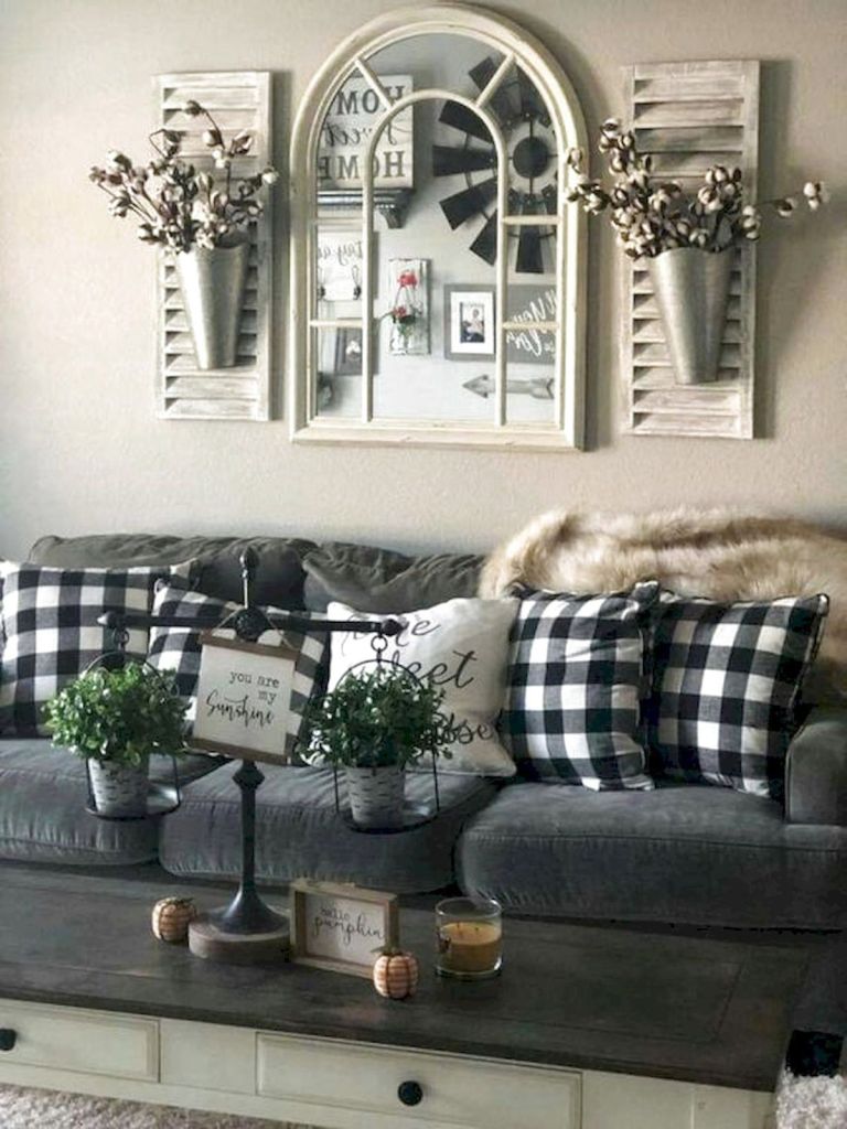
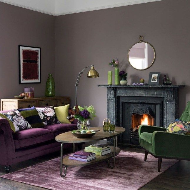
Brown
It indeed represents naturalness, softness, tradition, serenity, comfort, stability. Because it symbolizes the past, nostalgia and is considered a color conducive to stagnation, brown is not a color widely used or recommended in Feng Shui.
Combined with a palette of its own nuances or a warm gray, brown evokes a comfortable, elegant interior and a very current decoration. The navy blue and chocolate brown marriage is a perfect match for an atmosphere that is both refined and classic. Of course, brown and white form an incomparable and flawless duo for a design decor spirit. Combined with clear neutral shades, such as cream or sand, it creates a more enveloping environment.
Married with cool colors like sky blue or green water, the atmosphere will be dynamic just like with warm colors like yellow or orange. If contrasting harmonies are possible, avoid combinations of brown and vermilion red or even brown and emerald green which lead to an austere and dull decoration.
The best alternative to brown? The mole. Halfway between gray and brown, taupe is a warm color that harmonizes with almost all other shades, which is suitable for any room in the house and which suggests a soft and enveloping interior. Timeless, the mole is a safe color to adopt to be sure not to get bored.

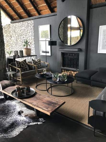
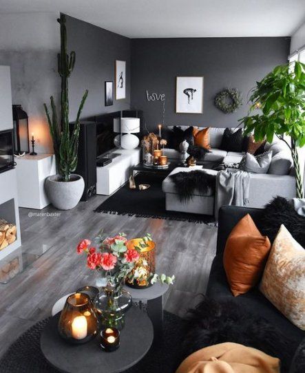
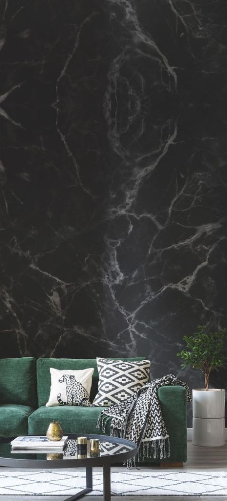
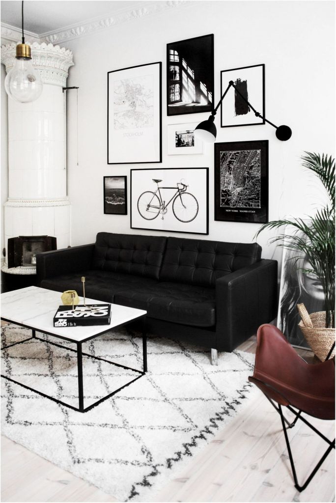
night black
The black color is recognized for establishing a certain elegance and a contemporary style in the pieces that are adorned with it. This color that absorbs light is recommended in a bedroom, living room or room for a chic, modern atmosphere that evokes the serenity of the Zen and Japanese style.
Used by touch, black adapts to all styles whether it is design, retro or industrial. It is found in sleek, minimalist and authentic interiors in which it provides a subdued and cozy atmosphere, especially if the paint is matt.
In a bathroom, black will describe several atmospheres depending on the paint finish chosen and the style of the sanitary facilities installed. A bathroom with walls adorned with black painted wooden slats and fitted with a bathtub with clean lines will give off a sober Scandinavian style while a bathroom with satin black walls and a lion’s feet bathtub will distill a precious boudoir-like atmosphere .
In a large living room, the total black look can be adopted as soon as the furniture takes on light and natural colors to bring balance and brightness.
In an attic room, combine black on the walls and white on the ceiling and on the beams to contrast and emphasize the architectural structure of the room.
If black is a particularly intense shade that associates with all colors, it will be able to fade to make room for the brighter tones if these are numerous in the same room.
Of course black and its accomplice white form a perfect duo to imagine a graphic decoration to be applied in living rooms such as the kitchen.
Finally, the black color combines perfectly with the pastel shades that it sublimates.
Discover all our black inspirations
Black vase, Fleux.
From left to right and from top to bottom.
Gray vases, Fleux. On the cube, ball vase, carafe and goblet, cushion and plaid, Home Around the World. Plaids, Fleux and Home Around the World cushion. On the floor, Hay cushions at Fleux.
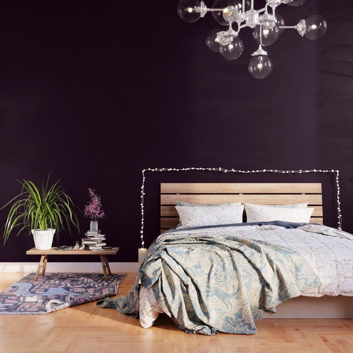
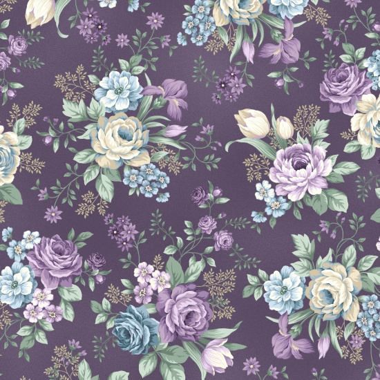
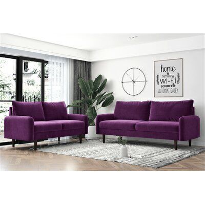
eggplant
purple a cold color which can also tend towards a warm color if it contains more red. Plum, magenta, parma, lilac, purple, mauve, orchid … the color chart of purple is rich in variants. The lighter the shade, the more it brings a feeling of freshness, the darker it is, the more it gives an impression of warmth.
Purple is a color that is easily associated and, with it, we dare to use contrasts. Successful combination and sure value: purple with white which enhances it while balancing its shade. It will be the same with beige. Used in shades – purple, plum, eggplant, purple – in a room, it creates an ultra feminine atmosphere. Combined with yellow, red or even green, the atmosphere becomes bright and invigorating. Finally, all its variations go well with gray for combinations with a refined spirit.
Black and gray vases, Fleux ‘. Pink metal candlesticks, Madeleine & Gustave.
From left to right and from top to bottom: glass ball vase, cup, goblet and carafe, Home Around the World. Plaids, Home Around the World. Plaid stacks, ENO at Fleux, two-tone Home Around the World cushion.
On the floor, Hay cushions at Fleux.
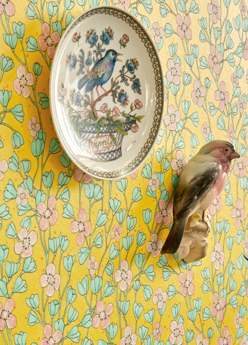
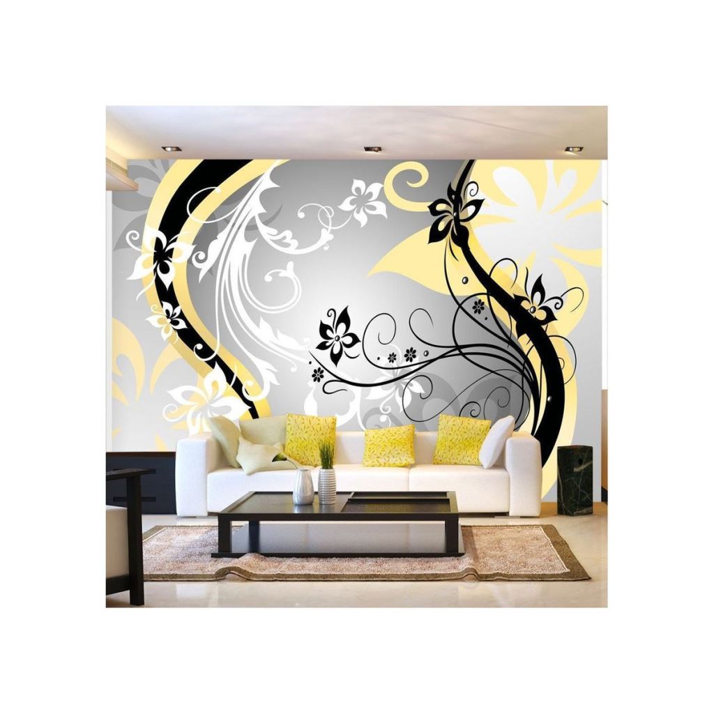
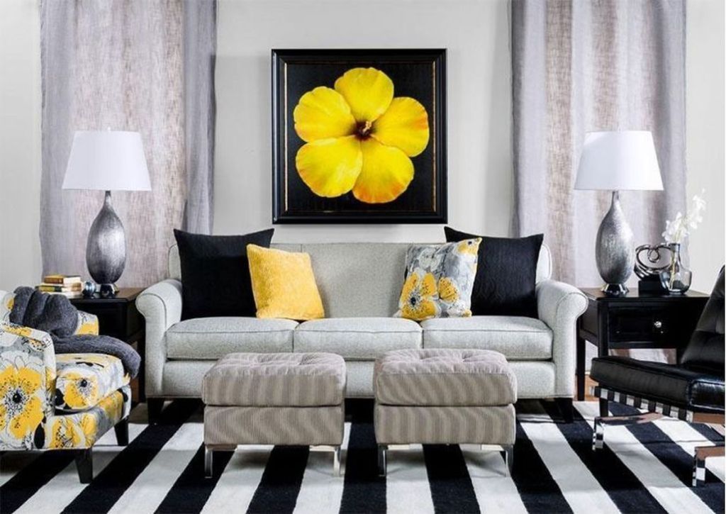
Yellow
Associated with joy, good humor, radiance, well-being and even idealism, yellow is a lively and stimulating color is also the symbol of friendship and brotherhood; it shows the need for contact with others. This shade also represents knowledge, knowledge and science.
We choose it mainly to dress the living rooms like the living room or the kitchen. This choice is justified for the brightness it brings and its invigorating side. Whether in a large space already well lit or to bring a little clarity in a darker corner to which it will give depth.

white
Bright color, white is ideal for enlarging the space. But too much white in an interior can suggest a feeling of coldness
White is associated with all colors. Do not hesitate to combine it with intense shades to which it will bring all their chromatic strength. For a chic and cozy decoration, mix it with shades of blue or beige, but avoid pastels that suggest a childlike spirit with less character
Black vases, Fleux. On the cube, ball vase, carafe and goblet, cushion and plaid, Home Around the World. Plaids, Fleux and Home Around the World cushion. On the floor, Hay cushions at Fleux.